
PB Art Academy Website
A premium educational website designed to strengthen PB Art Academy's digital presence and increase student enquiries.
A trusted local art academy, ready for a digital front door.
PB Art Academy runs structured drawing, painting, handwriting and specialised art programs for students of every age — from kindergarten first-strokes to adult and portfolio-level courses.
Word-of-mouth and a loyal parent community had carried the academy a long way, but there was no public website that reflected the quality of the teaching itself: no place to browse courses, see real student work, read reviews, or simply enquire without a phone call.
The brief was to design and build a proper public-facing website — a first impression that matches the academy's reputation, gives prospective parents everything they need to decide and enquire, and works as well on a phone as it does on a desktop.
Eight goals, one homepage scroll.
Every design decision on the site traces back to one of these.
Brand Identity
A consistent visual identity — logo, color system and typography — carried across every page.
Responsive Design
A layout that holds up perfectly from a parent's phone to a desktop browser.
Course Showcase
Clear, browsable course tracks with levels, duration and fees for every program.
Gallery
A filterable gallery celebrating real student artwork across mediums.
Student Admissions
A frictionless enquiry flow that turns interest into a booked trial class.
Trust Building
Real reviews, founder story and stats that reassure a parent before they call.
SEO
Structured, semantic pages built to be found by parents searching locally.
Performance
A fast, modern Next.js build so the site feels instant on any connection.
Seven pages, walked through page by page.
Every screenshot below is the live site — purpose, hierarchy, branding and mobile behavior, page by page.
Home
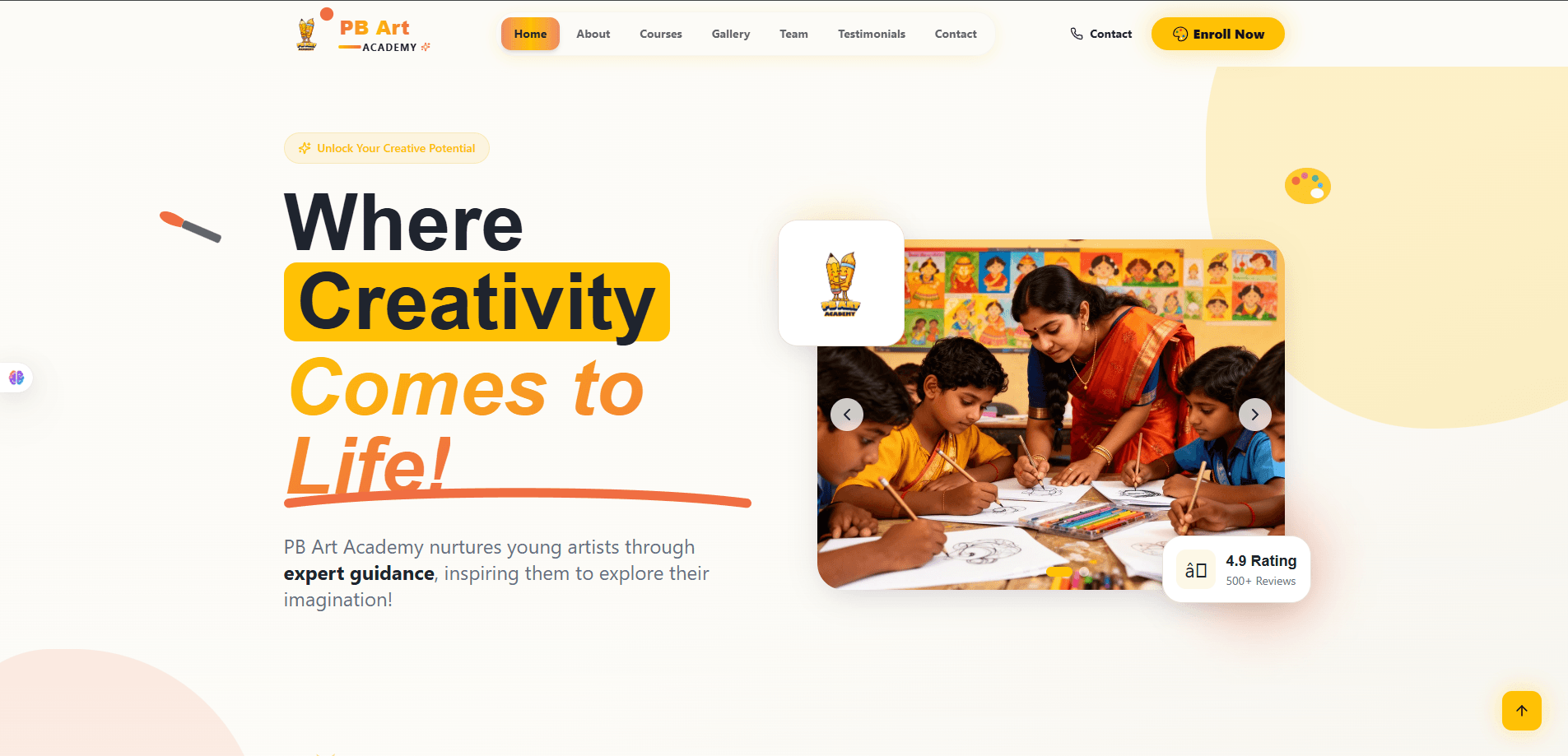
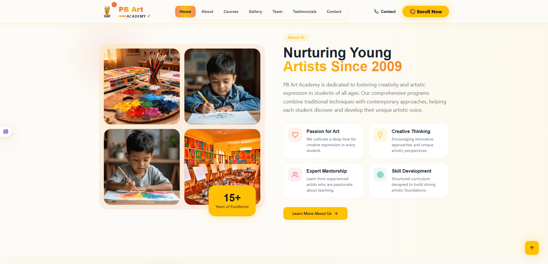
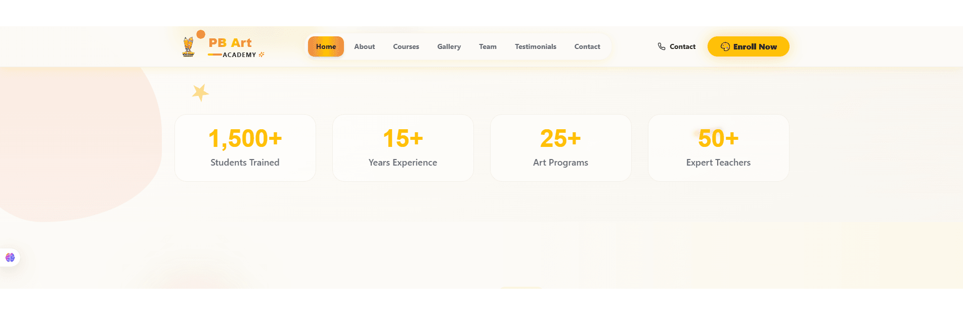
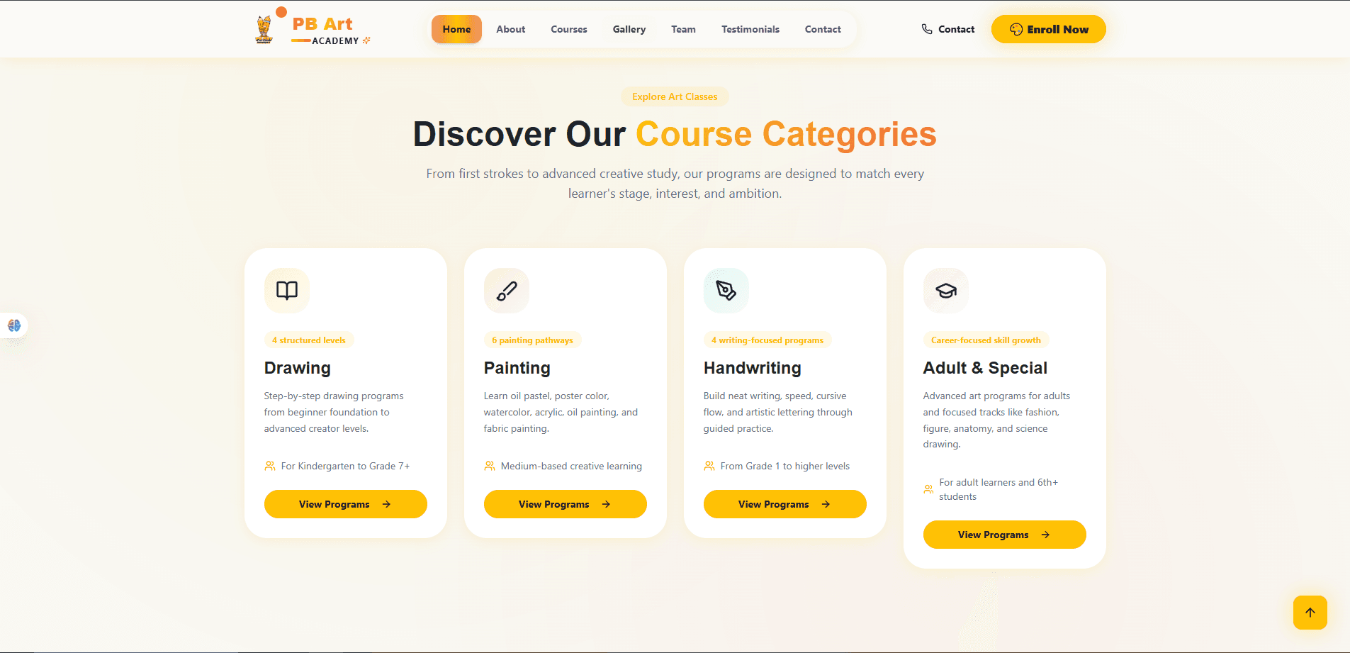
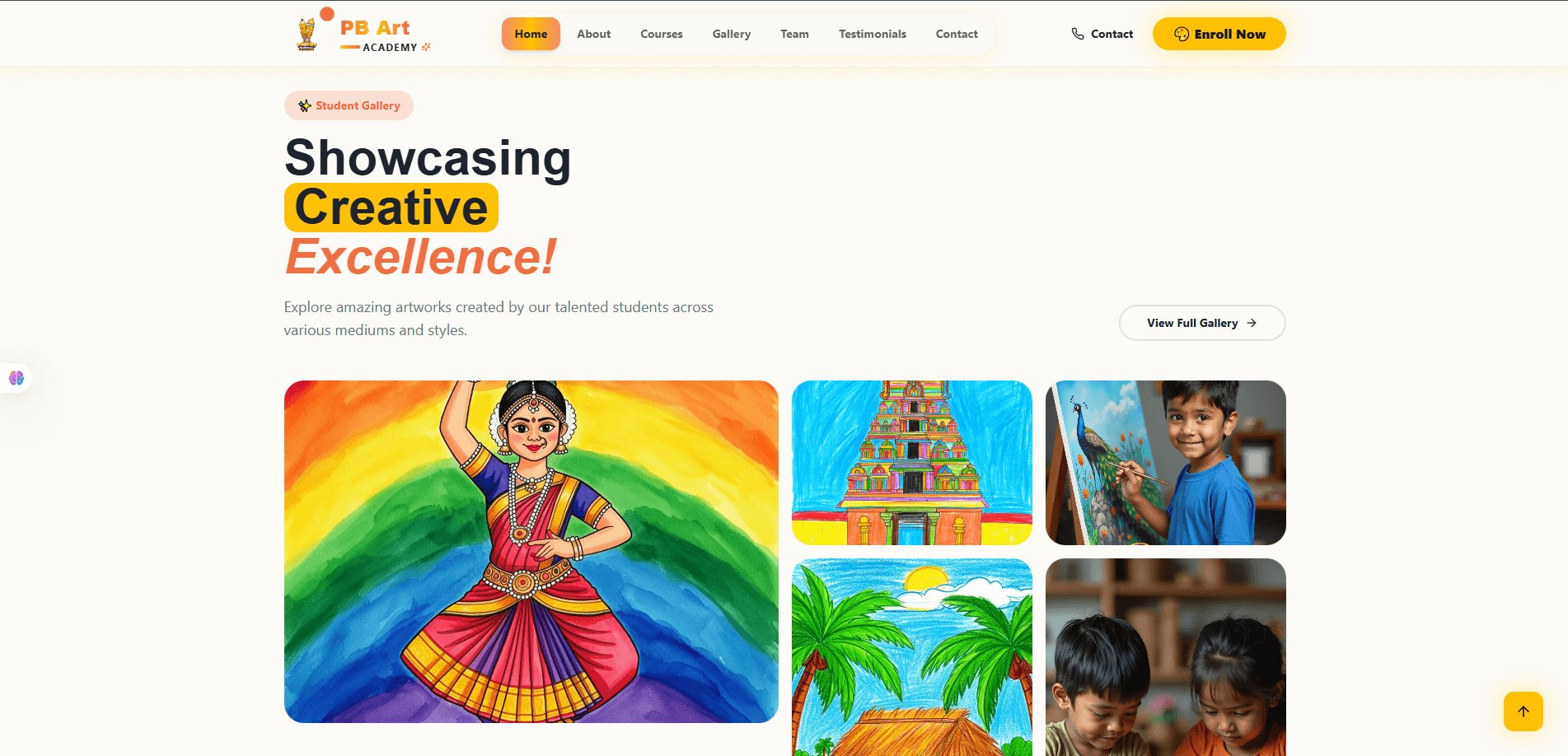
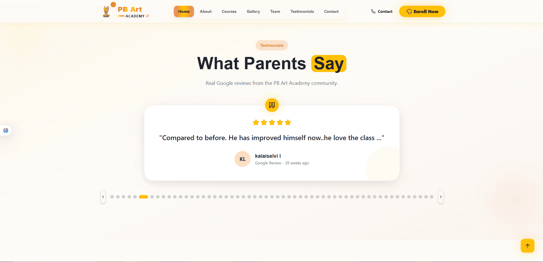
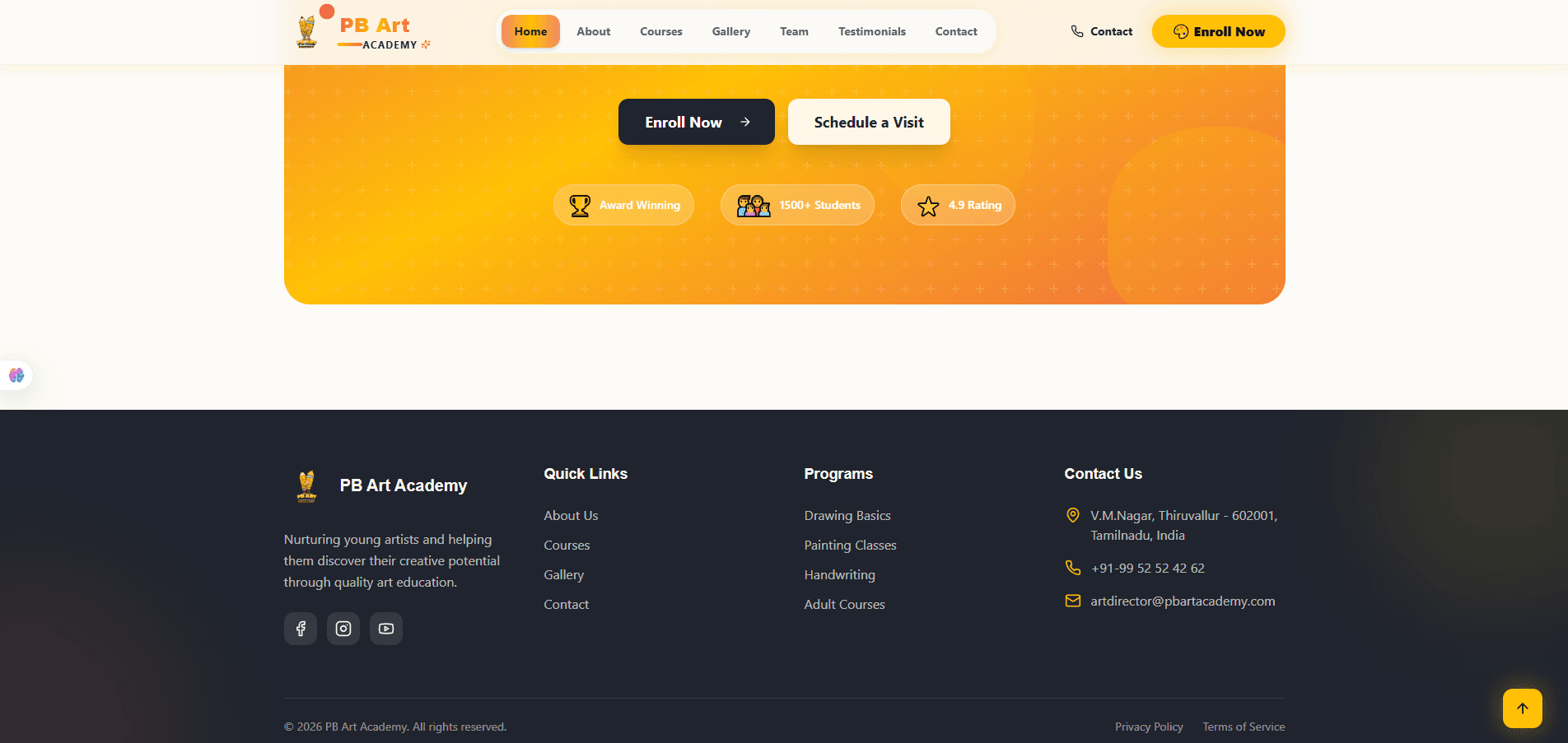
The homepage carries the full pitch in one scroll: a hero that opens on a real classroom photo and a warm, human headline, straight into a proof strip (rating, reviews), a founder-story preview, the numbers that build credibility, a course-category overview, a gallery teaser, a testimonial, and a closing call-to-action before the footer. Every section hands off cleanly to the next — awareness → credibility → offering → proof → action — which is the actual decision path a parent takes before enquiring. Each block is mobile-first: the two-column hero and image collages stack into single columns, and the stat bands wrap into a 2×2 grid on small screens without losing legibility.
About
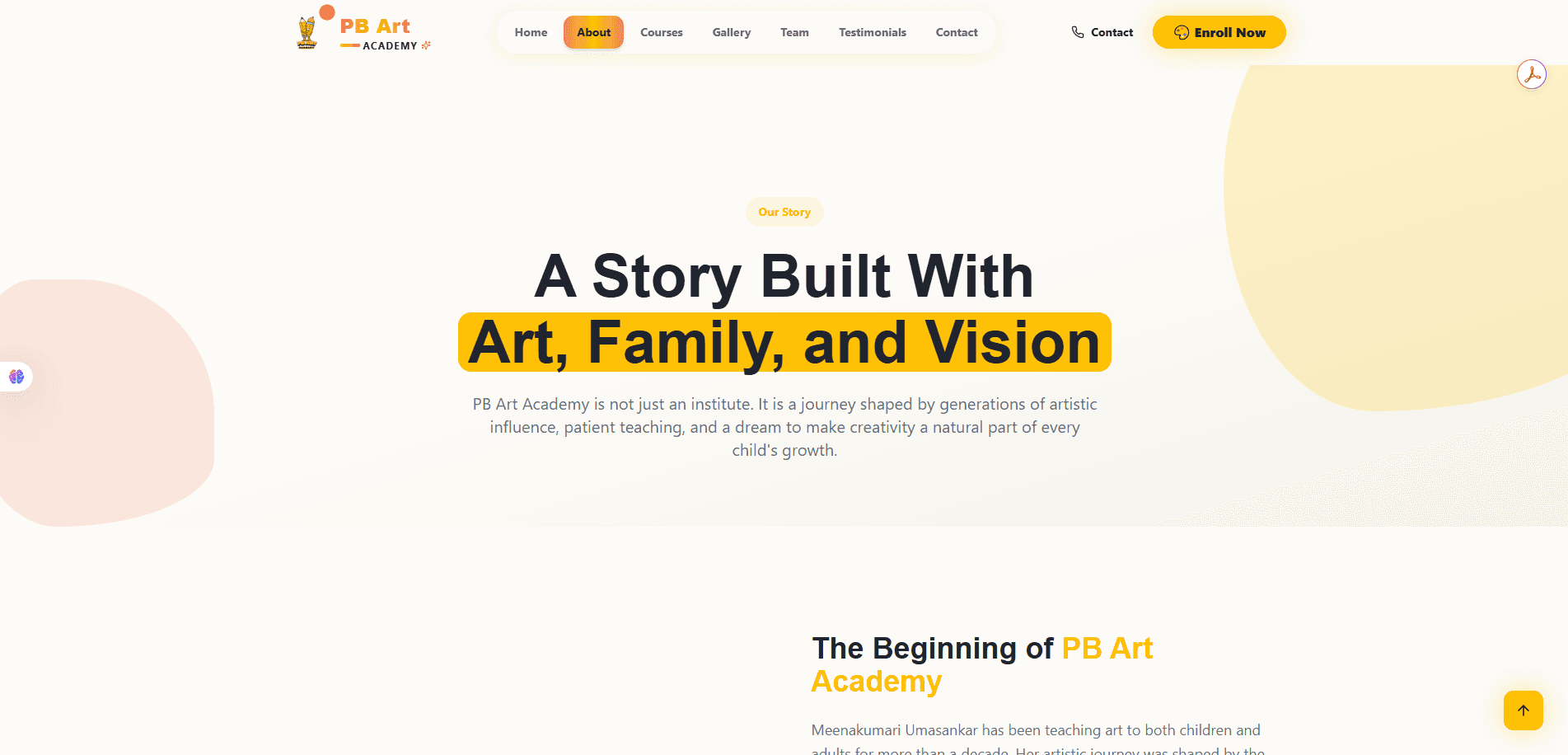
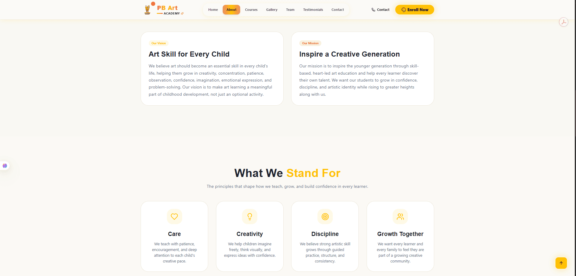
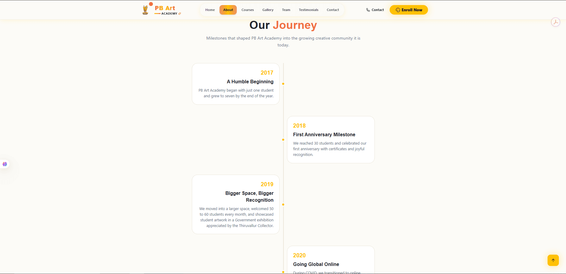
The About page slows the pace down deliberately — this is where trust is actually built. It opens on the founding story, moves into a vision/mission pairing and the academy's stated values, then closes with a timeline of real milestones. Structuring it as a chronological journey rather than a wall of text gives a skimmable shape to what is otherwise a lot of biography, and the timeline's alternating left/right cards make even a long history easy to scan on both desktop and mobile.
Courses
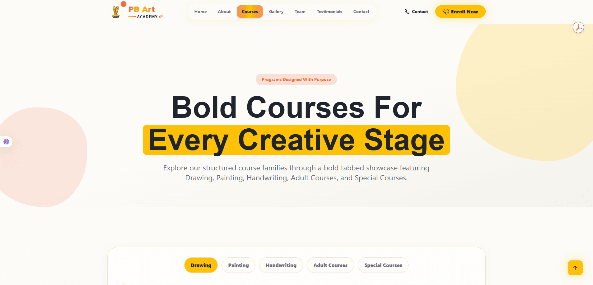
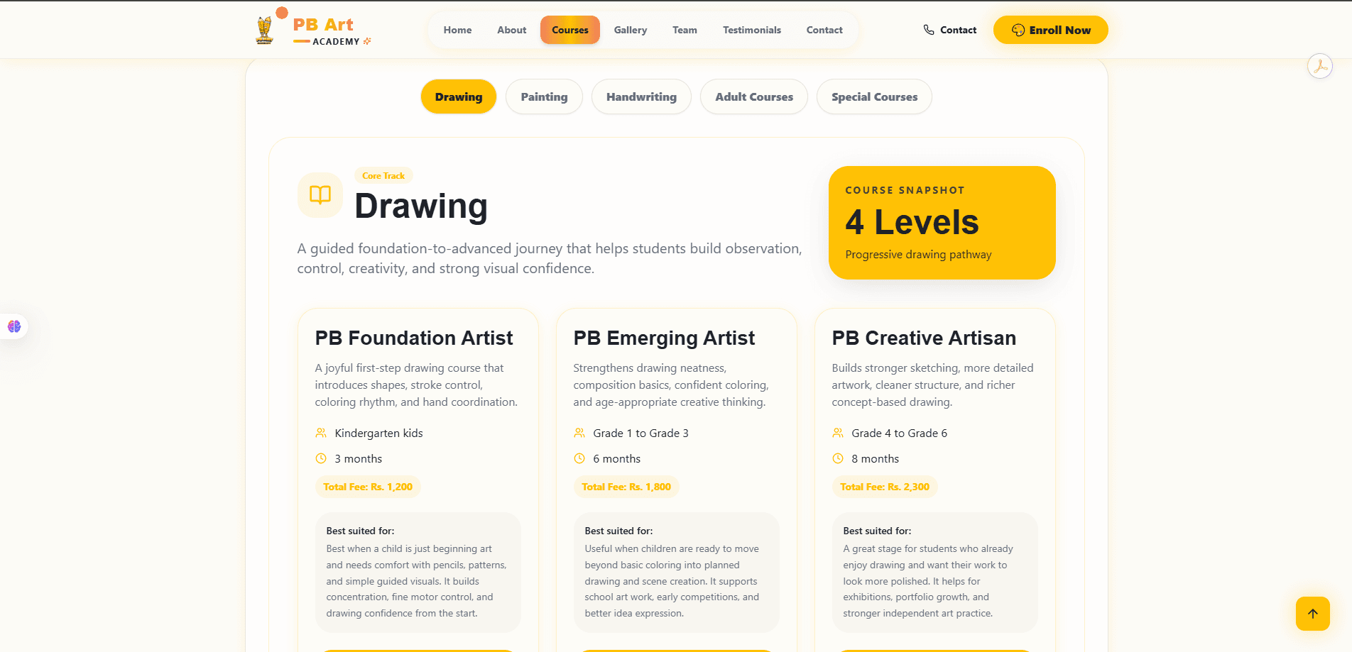
Courses are organised as a tabbed showcase — Drawing, Painting, Handwriting, Adult Courses, Special Courses — so a parent narrows to their child's interest in one click instead of scrolling a long catalogue. Inside each tab, a snapshot card states the structure at a glance (levels, pathway) before the individual course cards go into age range, duration, fee and who each level actually suits, which is exactly the information a parent needs before enquiring.
Gallery
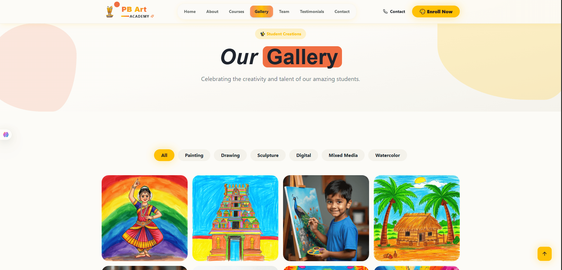
The gallery is the credibility payoff of the whole site — real student work, filterable by medium (Painting, Drawing, Sculpture, Digital, Mixed Media, Watercolor) so a parent can jump straight to the discipline their child is interested in. Square, evenly-cropped cards keep the grid visually calm even though the source artwork varies wildly in subject and color, which matters for a page whose entire job is to look inviting to browse.
Team
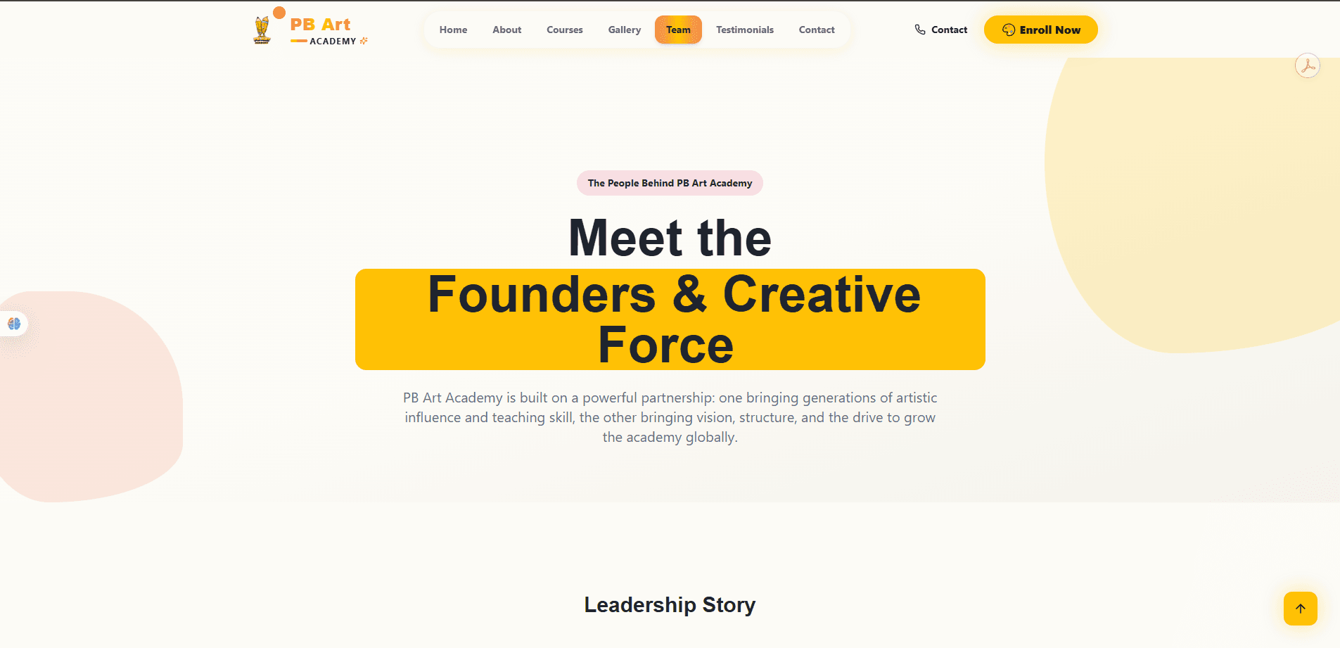
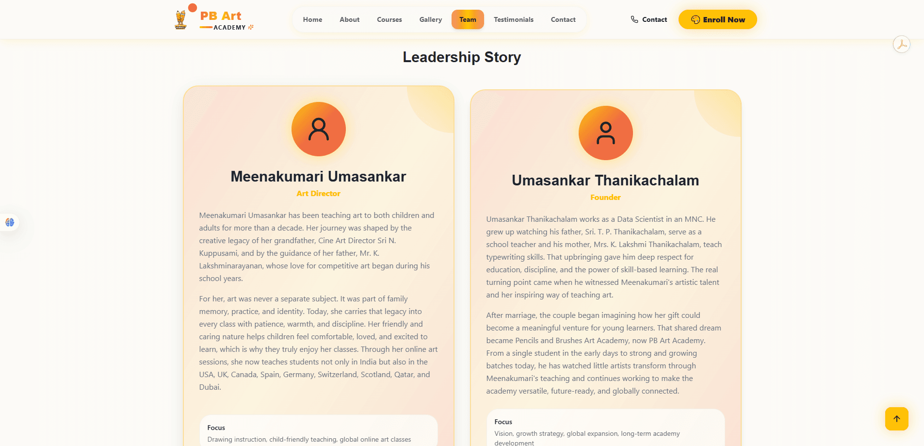
The Team page puts two real faces and a personal story behind the brand — the Art Director and the Founder, each with their own path into art education. For a business that is fundamentally about trusting someone with your child, this page does more trust-building work than any stat band could, and it's placed deliberately in the main navigation rather than buried at the bottom of About.
Testimonials
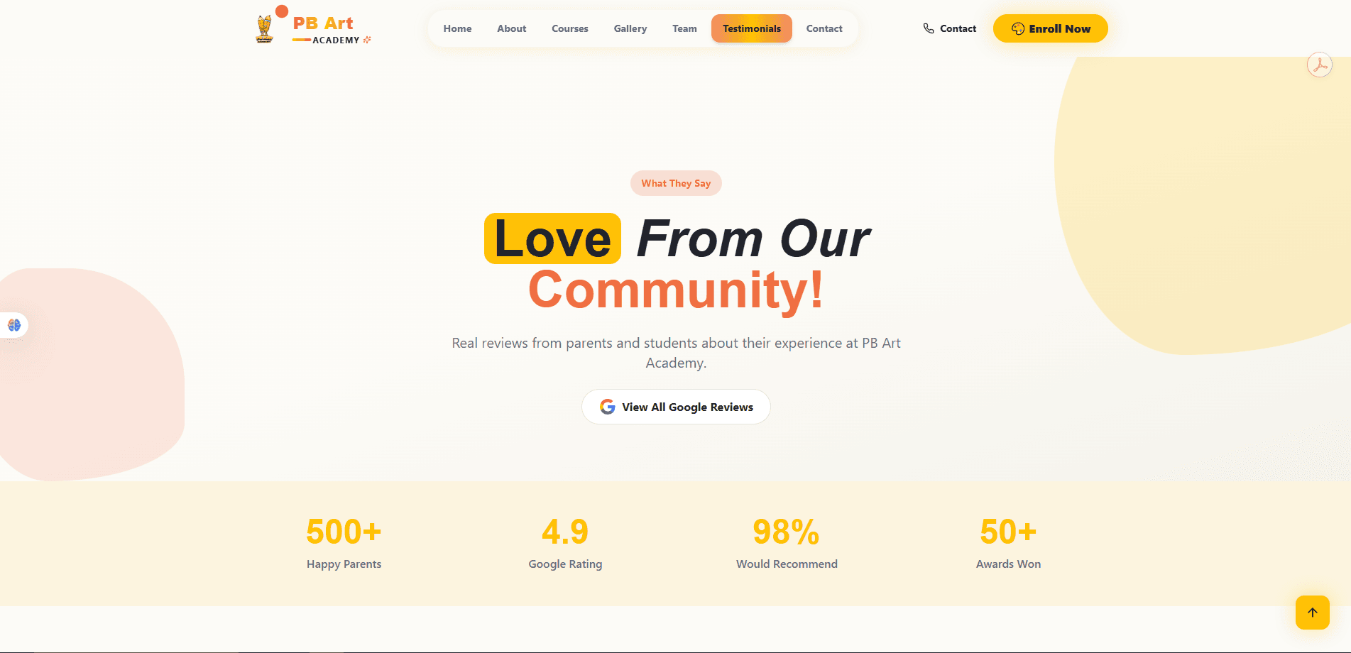
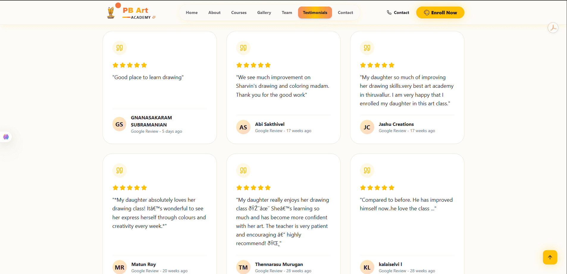
Testimonials get a full dedicated page rather than a homepage afterthought, opening on the headline numbers (rating, recommend rate, awards) before a full grid of real Google reviews with star ratings and reviewer names. Surfacing genuine, dated reviews — not curated pull-quotes — is what makes this page function as proof rather than marketing copy.
Contact
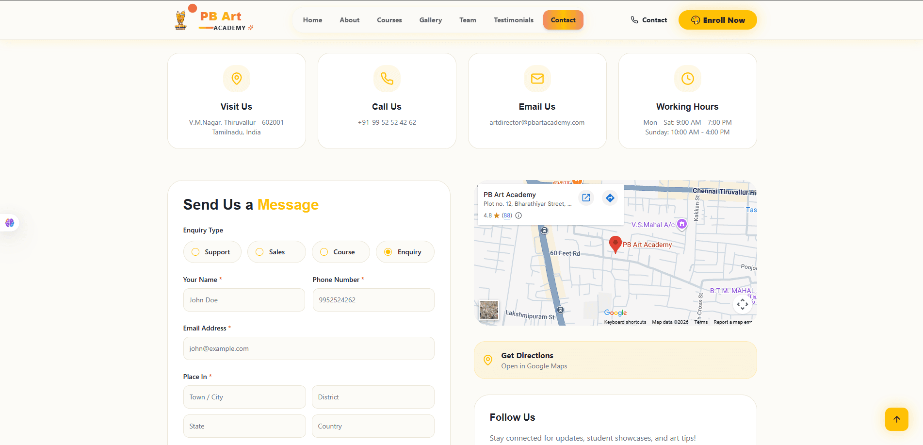
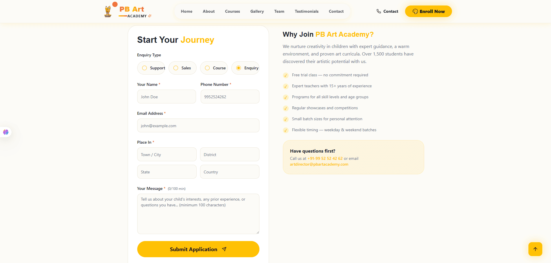
Contact closes the loop with every channel a parent could want — visit, call, email or message — plus an embedded map and working hours, so there's no dead end for someone ready to act. A structured enquiry form (enquiry type, contact details, location, message) sits alongside a short "why join" reassurance panel, keeping the conversion moment and the final trust-building copy on the same screen instead of separating them.
The details that make it feel premium.
Ten small decisions that add up to a site that feels considered, not templated.
Modern typography
A bold, editorial type scale carries the headlines while body copy stays restrained and easy to read at a glance.
Color system
A warm amber/orange accent on a soft cream base — distinctive, on-brand for a creative academy, and never fighting the artwork it's displaying.
Navigation
A pill-style top nav with a clear active-state highlight, so a parent always knows exactly which page they're on.
Hero sections
Every page opens on its own purpose-built hero — not a repeated banner — so each section immediately signals what it's for.
Call-to-action
"Enroll Now" stays visible in the header on every page, with secondary CTAs ("Schedule a Visit", "View Full Gallery") placed exactly where interest peaks.
Responsive layout
Multi-column heroes, collages and stat bands all collapse gracefully to single-column, thumb-friendly layouts on mobile.
Animations
Subtle motion on section entry and hover keeps the site feeling alive without ever slowing a parent down.
Micro-interactions
Hover states on cards and buttons, active-tab highlighting, and a smooth back-to-top control add polish at the small scale.
Image presentation
Consistent rounded corners, soft shadows and generous framing make photos and student artwork feel curated, not just uploaded.
Visual storytelling
The page order itself tells a story — creativity, proof, offering, people, reviews, contact — so browsing the site mirrors the trust-building conversation a parent would want to have.
Everything the site ships with.
Straight from the build — no roadmap items, just what's live.
Responsive Design
A fully fluid layout tuned for phones, tablets and desktops alike.
Course Pages
Tabbed, level-by-level course tracks with fees and duration.
Gallery
A filterable showcase of real student artwork by medium.
Testimonials
A dedicated page of real, dated Google reviews with ratings.
Contact
Map, working hours, direct contact details and a structured enquiry form.
Fast Loading
Built on Next.js for a snappy, modern loading experience.
SEO Ready
Semantic, well-structured pages designed to be found by local search.
Modern Navigation
A clear pill-style nav with active-state highlighting on every page.
Accessibility
Readable type scales, clear contrast and predictable navigation throughout.
Premium Branding
A cohesive visual identity carried consistently across all seven pages.
A modern, typed frontend — nothing more than it needs.
A Next.js 14 App Router site, styled with Tailwind and animated with Framer Motion.
Next.js
v14 · App RouterRouting, layouts and page composition, built on the App Router project structure.
React
v18Powers the component-based frontend throughout the site.
TypeScript
TypedTyped components, utilities and shared data structures across the codebase.
Tailwind CSS
StylingLayout, spacing, typography, responsiveness and custom accent-color styling.
Framer Motion
AnimationSection-entry animations, transitions and interactive motion effects.
Lucide React
IconsThe icon set used across navigation and UI sections.
clsx
UtilityConditional styling and reusable class handling across components.
PostCSS + Autoprefixer
Build pipelineTailwind processing and cross-browser compatibility in the styling pipeline.
ESLint
Code qualityEnforces code quality and consistency across the project.
Component Architecture
app/ · components/ · lib/Reusable UI components, with utilities, data helpers and types kept in lib/.
What made this harder than it looks.
Five real tensions the design had to resolve.
A premium first impression
The site had to read as premium from the very first scroll — no generic template feel — while still feeling warm and approachable for parents.
Creativity vs. usability
Bold, expressive design had to stay out of the way of a parent trying to quickly find a course, a fee, or the enquiry form.
Responsive layouts
Image-heavy sections — collages, galleries, timelines — needed layouts that held their visual balance at every screen size, not just desktop.
Performance
Rich imagery and motion had to be balanced against a fast, modern loading experience.
Visual storytelling
Seven separate pages needed to feel like one continuous narrative about the academy, not seven disconnected templates.
What the site actually changed.
Qualitative, honest outcomes — not invented percentages.
Professional online presence
PB Art Academy now has a public website that matches the quality of its actual teaching.
Improved branding
A consistent visual identity now carries across every page, from hero to footer.
Higher trust
Real reviews, a founder story and clear stats give prospective parents reasons to believe before they ever call.
Better admissions funnel
A structured enquiry flow gives interested parents a clear, low-friction next step.
Improved mobile experience
Every section was built mobile-first, where most parents are actually browsing from.
Modern user experience
Motion, hierarchy and pacing now guide a visitor through the site instead of leaving them to hunt for information.
A digital front door that finally matches the academy behind it.
The PB Art Academy website turns word-of-mouth reputation into something a prospective parent can browse, verify and act on — courses, real student work, real reviews, and a clear way to reach out, all in one coherent, premium experience.
Built page by page around the site's own navigation — Home, About, Courses, Gallery, Team, Testimonials, Contact — every section has a clear job in the same story: this is a place that teaches art seriously, and it's easy to become part of it.